How to Mix Antiques into any Decor

I recently had the privilege of being a guest blogger for the River North Design District. Below is the blog I wrote:

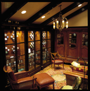
I always try to mix antiques into any design project I’m doing because it’s important to infuse the clients’ personality into their décor. I certainly don’t want the home looking stale. I usually prefer the classics…Asian, of course, works well with almost anything, but I love Art Deco, any of the Louis periods, some English and Irish and there is always Biedermeier. Although, you have to be careful of eras that could clash. For example, I usually do not do Victorian with contemporary, or Grandma’s pieces unless they can be modified to suit the décor. I also make sure colors and textiles complement each other when I mix them. If a textile is in good condition we try to keep it, but if it is in bad condition or if it would suit the décor to change it, we will.

I did an Art Deco emerald green velvet sofa with a carved wood frame in leather (which changed it from feminine to masculine) and added a diamond tufted back and stuffed the piece in a synthetic horsehair to improve the comfort. I then changed the color to work with the new scheme to include the existing fabric color or wood tone to be harmonious with the overall scheme. All the patterns need to work in the décor. Work with multiple patterns by keeping the some patterns as either a centerpiece or as a coordinate, letting an antique pattern take the lead or bring in other fabrics and use patterns or textures that work well with the antique fabric. When you mix woods together, remember that mahogany, cherry and oak are formal, so they’ll go well with one another. Pine, maple, and bamboo are casual choices, which means that they’re compatible with one another but less so with formal woods.

When mixing, you can usually mix casual and formal to alter the overall look, if the client wants, but I try to keep the finish original and work in the wood by varying the combination of woods on the project. Finally, don’t be led astray by rules (for example, I’ve heard of some designers using the 80:20 rule — 80% of one style and 20% of another for blending). I never assume such a ratio….I usually defer to what works well for the client, and usually I balance and blend several kinds of antiques, not just one. This has worked for me for more than four decades as an interior designer, so I’m going to continue to do it!
8.7.2 (104)

Who is bored with paint and wallpaper?

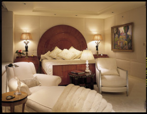
This luxurious bedroom features upholstered walls in ivory silk.
Recently, a client told me that she wants to make a change from paint and wallpaper and asked for my input on what techniques for walls can liven up her room. I think upholstered walls are a much more luxurious alternative to paint and wallpaper. Depending upon the fabric, upholstered walls create a warm, elegant and rich atmosphere and also soften a room. Fabric patterns and scenes also add to the luxurious feel. There are so many options with fabrics – suede, silk, cashmere and velvet and you can channel, panel or tuft the fabric for a variety of applications. Topaz woven heathered flannel is a wonderful, masculine alternative. Trims and cord welts, even mother of pearl and coral provide amazing detail.

As for paint, although murals are technically painted walls, they create an environment other than just plain paint. Additionally, the use of metal panels, wood or acrylic panels can bring a totally different dimension to any room.

But most importantly, have fun with it!

Why Designers Should Re-purpose Furniture

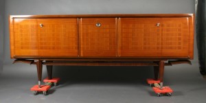
This gorgeous piece was ready for the kindling pile prior to it's careful restoration and refinishing.
This gorgeous piece was ready for the kindling pile prior to it’s careful restoration and refinishing.
In the current age of reduce, reuse and recycle, I’m proud to say that I definitely believe in and try to re-purpose furniture as much as I can in a design project. Incorporating existing furnishings is, to me, Design 101. I always use existing pieces in a project if the pieces are good, and can be used to achieve the new look desired. Many times I have redesigned a sofa to fit into a new look, or refinished a cabinet to work with the new theme. I try to be an environmentally conscious designer, so recycling a piece from one room to another is a solution worth exploring. For example, in a recent project, I turned an old frumpy sofa into a new classic by removing dated “bun” feet, eliminating the tufting, adding a dressmaker’s skirt, down cushions, pillows, cording and trim. It just takes creative ability and understanding.

Re-designing the 16th Floor of the Merchandise Mart

Recently, Cannon Frank was approached to redesign the 16th floor of the Merchandise Mart, which houses some of the hospitality and outdoor furniture showrooms. Mart executives were getting negative feedback from the head of the Outdoor Furniture Council that the decor needed a little sprucing up, so we approached the design from a buyer’s point of view, which was “if I am going to buy outdoor furniture, why do I go to a floor that looks corporate or institutional?” We designed the 16th floor utilizing neutrals infused with brilliant color. We selected a commercial quality carpet and with the yardages we had, we redesigned the color placement creating three coordinating carpet colors to give us a 24′-0″ repeat rather than a standard 8′-0″ repeat and brought in a full spectrum of colors. This helps you still feel that “tropical breeze” even while shopping for outdoor furniture in winter. We also eliminated the dated interior walls by building out the walls to create space for future advertising technology and to allow for additional wiring to accommodate all the additional support for that technology.

We also rose to the challenge of creating a new type of lighting for the floor…since we could not disrupt the existing tenants by ripping out the ceilings and installing costly additional receptacles, we used the existing junction boxes and fabricated a 1″ x 1″ brushed aluminum channel, which houses LED lighting strips in an updated and modern pattern in lengths of approx 20′-0″ and provides 2700 kelvins of light to the floor and costs less than the previous consumption of energy of the original lighting. So brighter, less costly to run and consistent bright lighting, modern technologies and color made for a warm and enjoyable environment in which to shop for hospitality and outdoor furniture needs.

16th Floor of the Merchandise Mart, Chicago

Cannon Frank in LUXE magazine!

Finally — at long last! Photos from the fun and memorable evening when Cary and I won our Chicago Interior Designer of the Year award are in the current issue of LUXE magazine. Click here to view it all:

http://www.luxesource.com/digital-editions/region/chicago

We’re on the second to last page, so click on the top back arrow to go right to the end of the magazine and simply scroll back two pages. Enjoy!

Experiences

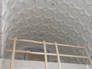
This is the paneled ceiling in the library -- it will be breathtaking when complete.
This is the paneled ceiling in the library — it will be breathtaking when complete.
Our lives are a bit like road maps, but we can’t see the map until we arrive. Rather, you can only see the map of where you have been and in many ways, it can be so overwhelming with feelings of excitement, tragedy, awe, anticipation and more. In an industry such as interior design, you recognize the difficulties, angst, frustration and the day-to-day grind, but when you see something come to fruition such as a decorative ceiling after the scaffolding comes down….well, sometimes you gasp and can enjoy the moment of wonder, pride and the swelling of joy….these moments are priceless.

All of our experiences can’t be wonderful, but the wonderful ones endure and add enough of those together and it binds me to this career.

For the Client

Put yourselves into the hands of an experienced designer and allow them to take you on a journey through your likes and preferences; yet listen to their version because most likely they see further than you. Always follow your heart and your gut, but if you clearly listen to the talent you hired, they will show you options to improve and make your wishes timeless.

For the Designer

You will have thousands of opportunities to create wonderful spaces, but do not allow your ego to sidetrack your client’s beliefs and dreams to suit your own taste. Delve into your clients “arena” and teach them how to “swim” in their own pond.

Recently a prospective client approached me on helping them save a spectacular property they found. They love the property, but the house interior is so dark, yet rich in mahogany paneling – walls, ceilings and corridors — it is way too heavy. I suggested painting all the paneling off-white and they thought that was sacrilegious! I explained it was only a minor expense relative to the overall cost of the property, and all the paneling is still there…only now it will be white instead of extremely dark brown, and will enhance the overall finished interiors. They lose nothing…..it is all still there, only it is now light!

Cannon Frank featured in Michigan Avenue Magazine!

Check out this article in today’s on-line edition of Michigan Avenue magazine:

Q&A: Interior Designers of Cannon Frank
We chat with one half of the dynamic interior designer duo to discuss what’s hot for homes.
March 06, 2013

Winning out over nine other local talents earlier this year, design team John Cannon and Cary Frank took the title of Chicago Interior Designer of the Year at the awards presented by The Design Center at The Merchandise Mart. Here, Cannon talks about what works in city spaces, his favorite elements of home design, and more.

What is trending in interior design right now, or what of-the-moment concepts do you love?
JOHN CANNON: We don’t follow color, fabric, or furnishings trends that much; we try to avoid fads and things that will be tired in a few years. The only trend we follow today is technology, and the introduction of new concepts in Smart Homes.

So on the opposite end, what are some classic elements you have always loved and used in your spaces, and always will?
JC: I love natural materials: stone, wood, and metals such as hammered nickel and bronze. I love a balance in textiles—not everything textured or everything shiny—[and] a blend of textures. Some shine, some pizzazz, some drama, some luxury, some earthiness. I think it makes for a more timeless interior and one that will fit any occasion.

Living in the city, many Chicagoans have tight spaces to deal with. How do you incorporate great design into a small space?
JC: I first consider our clients’ storage needs—I make sure there is always enough room to hide what they don’t want to be seen but need easy access to. We focus on the use of the space in our furnishing plans, and always consider scale so a smaller home does not feel cramped. The worst feeling [is when] you have spent a lot of money and tire of your home because you don’t have enough space.

What is your favorite room in the house to design? To spend time in?
JC: I am a creative person and I love to cook, so I always prefer to design the kitchen first—this is where most of the family time is spent. I like to fuss in the kitchen, but I don’t do the clean up! I end up sharing the space with my partner, Cary Frank, so it is extremely necessary that we have the capability to be in the kitchen without interfering with each other and our tasks. My second favorite space is anywhere we entertain, then my closets and bath—they all run a very close race since this is [where] I spend my time.

—Elle Eichinger

Read more at http://michiganavemag.com/channels/home-page/insights#2s6UHUtZcaE5i8Pv.99

Cannon Frank Named Chicago’s Interior Design Firm of the Year!

CIDYwinnersDear Friends,

It is with great excitement and honor that we announce Cannon Frank was awarded the coveted title of Chicago’s Interior Design Firm of the Year! Achieving this honor (the contest that was sponsored by Luxe Interiors + Design magazine and the Design Center at the Merchandise Mart) would not have been possible without all of your support – THANK YOU!

We would like to acknowledge our peers and fellow nominees and everyone involved in expressing our thanks for being nominated in such grand company. Thank you to Cindy Dooley and Kate Fortney for their hard work.
Events such as this are only possible through the efforts of industry masters such as Julia Chappell of the Merchandise Mart and Lisa Fraiberg from Luxe magazine, who strive tirelessly to promote our industry.

Our staff — Michael Nicholson, Maggie Boyaris and Bruce Wilson, our diligent corps of voters, our extended family, friends and clients who voted for us every day…thank you.

In addition to new local and new international projects, this is a wonderful way to start our year. So many more great things are ahead for Cannon Frank!

Thank you to everyone!

John and Cary

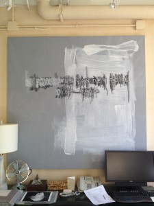
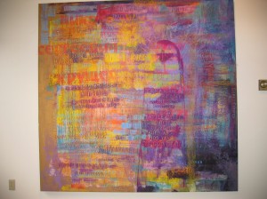
photoIMG_2492These paintings are by one of my favorite artists — Scott Covert, who is originally from New Buffalo, Michigan. Scott creates word maps of grave rubbings. He was a very successful “fixture” in the New York art scene during the 70s, 80s and 90s with friends like Robert Mapplethorpe, Keith Haring and the Studio 54 crowd. His work follows hilarious and touching themes, and his color sense is brilliant

Some of his rubbings have thousands of travel miles on them, years worth of time, and hundreds of names on them….no artist will endeavor this much for their art. Mies van der Rohe is one of my favorite architects, so naturally, this painting hangs in my office.

Moving!

Bittersweet…this photo is from last Christmas in the house we’re about to move out of. New memories to create for 2012, for sure.
Planning to move is such a difficult thing to do because of all the emotional baggage that comes with the project…anxiety, all the effort needed and the insurmountable decisions. So, plan ahead and determine what can be re-used, saved in SHORT TERM storage and given away.

For the client

The easiest is to start by throwing away everything you will never use again and clean out the attic, basement and closets. Pack everything you intend to take to your new house, then hold a sale to sell everything you don’t want to keep….everyone has things they think should be thrown out because they think no one would really want it, but put it in the sale…they are the items that sell first!
Don’t rush the packing unless you have an impending closing, but do plan everything way ahead so you have less stress. Put announcements in all the local papers if you are having a sale, and enlist all of the family members to help you, even friends who will help manage an estate sale with you. Plan to give the family members all the antiques from Grandma and if they don’t want them…sell them in the sale.

Recently, Cary and I had to pack up a 4,628 square foot house filled to the roof with three generations of both of our family’s possessions, in addition to all of our possessions we had collected over our 32-year history at the house. Cary’s family had been there since 1931, so believe me….there were a lot of things going to the dump, into the sale, and gifted throughout our family members so they, too, can share their family’s heritage. I had photos of my great great grandfather with his bride and his family photo of him as a child in school…thank God my mother noted who was who on the backs of all those photos!
Ask your designer to help you value the items you want to sell and let them know about some of the items they will need for use in your new home. Some items which need be re-upholstered should get out of the house sooner so you have time to recover and get to the new house in time for move in.

For the designer

Make room for keepsakes…it helps make your client’s home more of a livable space and some things are just worth keeping despite your aesthetic preferences. Accept the challenge and recover Grandma’s old sofa in antiqued leather and put it in a library….make it feel as though it was intended for that space. All in all, remember your final goal and that each day is an accomplishment toward that goal…then once it is in sight, enjoy the relief it gives to purge and start anew.